
Data Visualization With Python & Dash
Dash is simple to use and easy to learn


Overview
I had a Python assignment recently, the goal was to build a model to predict Stock prices. As a Front-end-based coder, it is quite hard to learn all the techniques to accomplish the goal (data prep, model training, visualize, ...) in a short amount of time. With the help of Dash, the visualizing part has become easier than ever.
Dash is a python framework that is built on top of React (my favorite), the free version packed all the features that you need for creating SPA with interactive UI.
Packages you need:
- plotly
- dash
- dash_core_components
- dash_html_components
Let's start:
Create an app.py file in your working directory, then start importing packages. These are the packages that I will use in this article:
import dash
import plotly.graph_objects as go
import dash_core_components as dcc
import dash_html_components as html
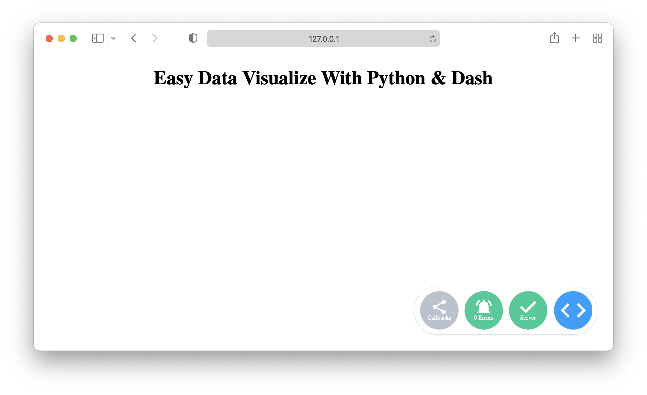
Init the web page and add a header to it. Remember to turn on debug mode, it will save you a lot of time in the development phase:
app = dash.Dash()

app.layout = html.Div([
    html.H1('Easy Data Visualize With Python & Dash', style = { 'textAlign': 'center' }),
])

if __name__ == '__main__':
    app.run_server(debug = True)
Note: add multiple children to
Divelement by the array syntax ([])
Then run the file with python app.py and open the link on your browser to see what we built so far:
Next step, add the basic graph, put it next to the H1 title:
dcc.Graph(
    id = 'my-graph',
    figure = go.Figure(
        data = [
            go.Scatter(
                x = [1, 4, 8, 9],
                y = [2, 6, 0, 2],
                name = 'Line 1'
            ),
            go.Scatter(
                x = [2, 4, 7, 9],
                y = [7, 2, 5, 0],
                name = 'Line 2'
            )
        ]
    )
)
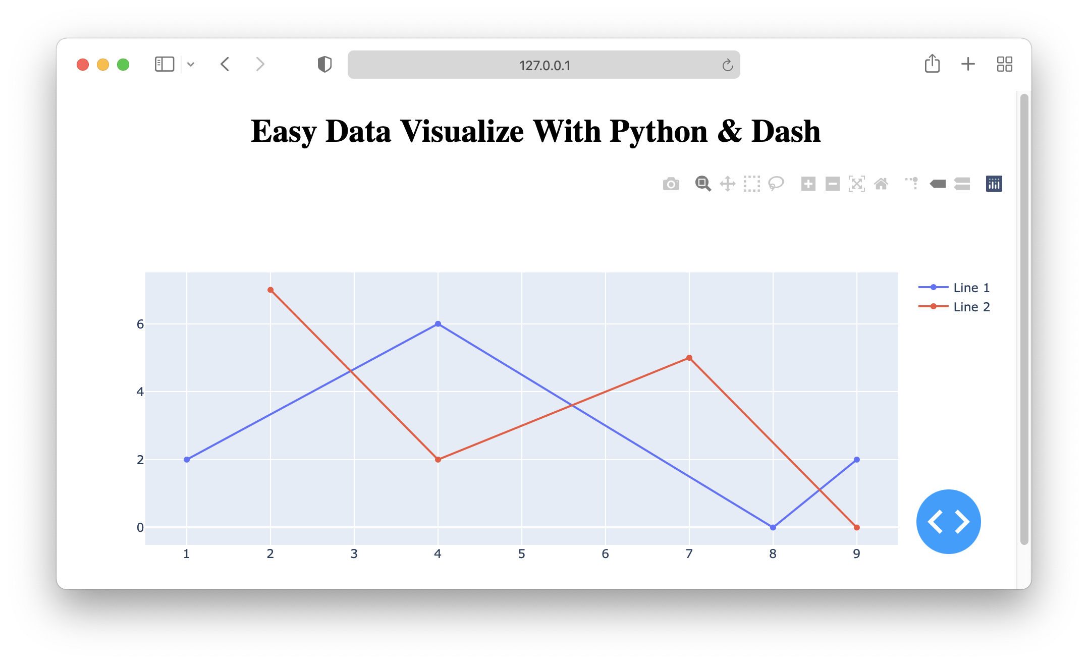
The Graph component has some built-in action to play with data like zooming, dragging to focus on a specific time frame, take and save screenshots, auto-scaling on window size, …
Cool tips:
Change the tab title on the browser
By default, your tab on the browser will have the default title, simply add this line of code to change the title:
app.title = 'Custom Title'

Using CSS
Dash supports raw CSS file and it will be packed in with your code automatically. First, you create a folder named assets next to your app.py file and put your CSS file in there.
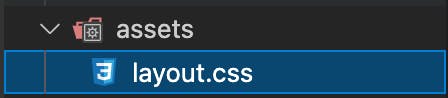
Then you can start using className to style the component:
# app.py:
html.H1('Easy Data Visualize With Python & Dash', className = 'title'),

# layout.css
.title {
    text-align: center;
}
Conclusion
- Dash is so easy to use because the syntax is human-friendly. You can find more info about the Figure and Scatter for further graph customization.
- Of course, we have much more advanced techniques to build an epic data visualize web page, for example,
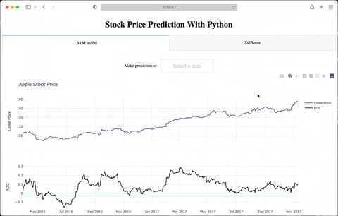
@app.callbackfor changing the input orLoadingcomponent for better UX, … Let me know if I should share more about them 😄. - This is the result for my assignment, I added
RangeSlider,DatePickerSinglefor more dynamic data: